Portfolio Website: Case Study
Project
Overview
I started this project as part of the CareerFoundry “Frontend Development for Designers” course. My goal was to take existing wireframes and create a functioning portfolio website to showcase my projects and skills as a UX Designer with coding skills. In this project I went from writing a basic HTML structure to usability testing, quality assurance and publishing the website using static hosting in AWS S3 bucket.
During the project I have learned a lot about HTML and CSS, as well as basics of JavaScript. Overall, it was a great learning experience, not only in terms of learning to code, but also understanding how designs and codes can work together, the importance of grids and design systems not only for designers, but developers as well.
I worked on the project as a team of one and used the following tools:
- Atom (including linter packages)
- GitHub Desktop
- AWS S3
- Cloudflare
- Crossbrowsertesting.com
Context and Challenge
As part of the UX Certification program with CareerFoundry, I chose to take up the “Frontend Development for Designers” specialization. I had a very basic knowledge about HTML and wanted to improve and modernize it. While I wasn’t counting on becoming an actual Frontend Developer, I hoped that the course would give me knowledge needed to understand the developers’ perspective as well as design and prototype products with a solid comprehension of technical possibilities and limitations.
As the course project focused on developing a portfolio website, I also saw this as an excellent opportunity to create on the real product, which would help me showcase my achievements and skills as an aspiring UX Designer.
In short, my challenge was: how can I with a minimum amount of knowledge and skill build a responsive portfolio website in under 60 hours?
Process
Design
The project brief focused on three main parts of a portfolio site:
- Main Page
- About me
- Case study pages for each project
The brief also included the low-fidelity wireframes suggesting layout options for all three pages, including desktop, tablet and mobile options. In the interest of saving time, I decided to lean on existing wireframes to have more time for creating assets and developing the website itself.
As I have already started working on a portfolio content prior to this project, I have used my notes from portfolio example research where I’ve looked at their content and structure. In addition, I’ve looked into user personas for my portfolio: recruiters, hiring managers and colleagues.
Keeping this information in mind helped me select the content necessary for the portfolio and its format.
Development
With the goal outlined, I started development by creating texts and images first. For images, I needed to keep in mind mobile vs. desktop sizes and proportions. At first, I simply created smaller versions of the desktop images for mobile, but with time, as my project was taking shape, I replaced them with images purposefully made for smaller screens.
In addition, I’ve identified the color scheme I could use and checked it for accessibility before committing. Having designed accessible training products in the past, I found that thinking about accessibility before development can save considerable time and effort down the road.
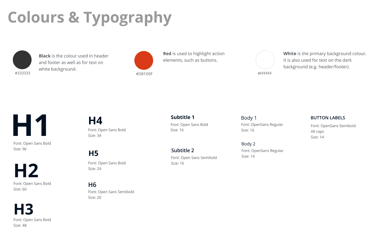
With the assets and styling ready, I’ve used Atom to write the code. I’ve saved my work on GitHub, which was quite useful for going back in time when things didn’t go as well as planned…
I started off by creating a basic HTML structure and later applying CSS styling and media queries. As a final touch, I’ve used JQuery to create an adaptive navigation menu for mobile view:

During the development I relied on feedback from my mentor and a lot of self-study: StackOveflow and W3School were my go-to resources for many questions. In addition, I experimented with the Chrome “inspect” mode to see the effect of changes. This helped me to experiment before committing changes to code and understand the meanining and impact of element properties.
Overall, I was surprised how easy it was to start creating a website on your own. While I know that I touched upon very basics of frontend development, I realized that now I can better understand the structure and code of websites. In addition, the project helped me understand the concept of the grids and the benefit of reusable layout patterns and objects (such as buttons).
Usability Test
With the MVP of my portfolio done, I’ve conducted a short usability study. Due to participants’ availability, I wasn’t able to recruit representatives of all three personas and feedback from the study was limited to perspectives of hiring managers and peers. This is something that I am planning to address at a later stage.
To analyze the findings, I’ve used Jakob Nielsen’s rating scale to classify all issues. I was quite pleased to see that no usability catastrophes were uncovered and that participants completed all tasks included in the test script.
The top 5 issues I have identified were:
- Navbar item “Work” was confusing. Participants didn’t expect that it would lead to the section “Project” on the main page, and some associated this word with “Employment”.
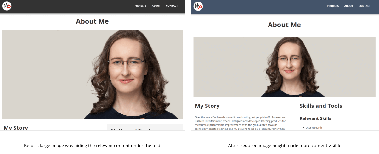
- The images on “About me” and project case study pages were seen as “too big”. Respondents expected to see some text together with images when loading the page for the first time.
- Page layout for case studies needed clearer structure.
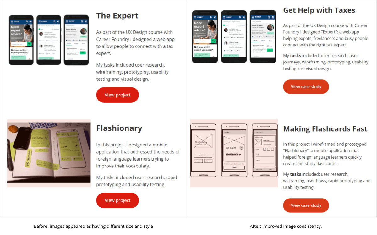
- Images on the landing were perceived as having different size and style.
- 5. Skype information was deemed too personal and irrelevant.
Further Iterations
Solution
In the end, my portfolio included the following pages:
- “Projects” page (main page) from which visitors could access project case studies.
- “About me” page, with information about myself and link to my downloadable resume.
- Several case study pages, describing each project in more details.
Following testing and feedback, I have made several improvements to the page layout and content.
Main Page
Based on feedback, I have updated the project images on the landing page to appear more uniform.
About Me Page
Original wireframes featured a large image under the heading, hiding most of the content under the fold. Based on feedback, I reduced the image height so that pertinent content could be seen above the fold.
Case Study Pages
I improved the layout suggested in the original wireframes by placing the images after the relevant text (rather than before it). In addition, I added a background color to section headings signifying bigger phases of each project. With this change the case study pages should be easier to scan and understand at a glance.
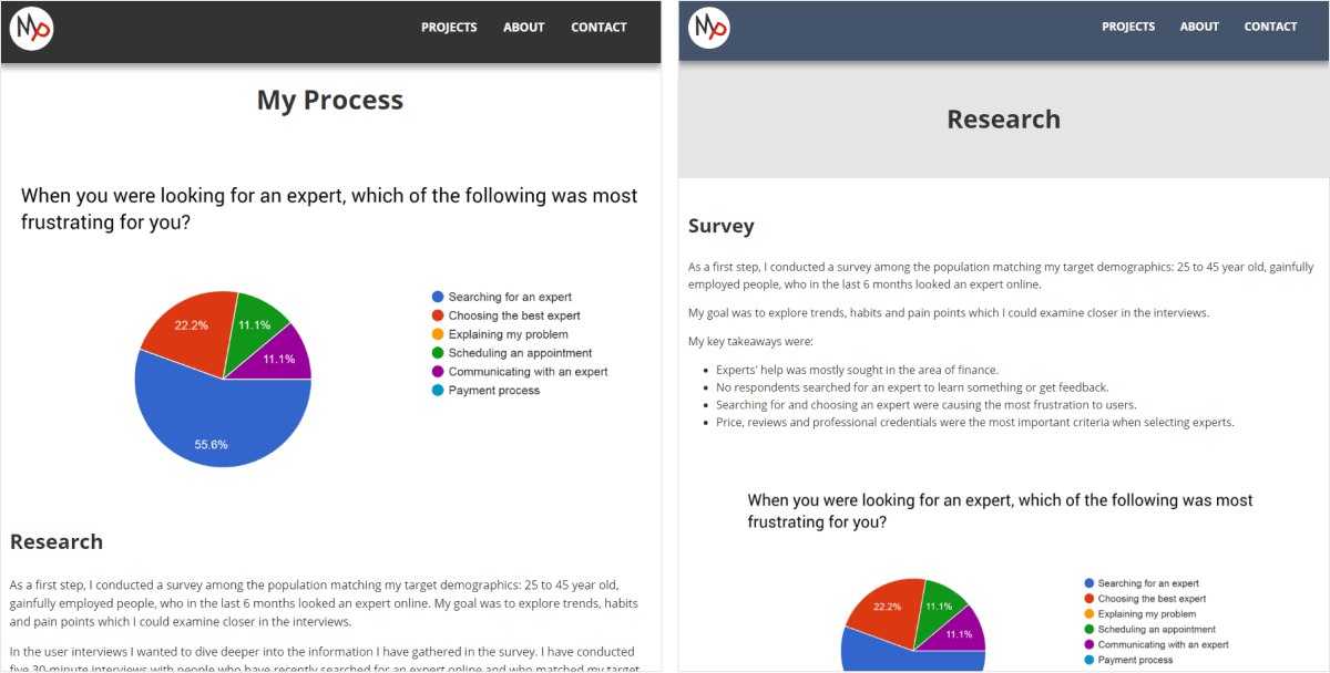
As you will most likely notice, I have also made changes to the overall colour scheme. While the respondents appreciated the high contrast the original design had, it was perceived as "gloomy" and "emo", which didn't correspond to the impression I wanted to provide. Since my portfolio includes variety of images in different styles and colours, I wanted to keep the simple and neutral colours of my original colour scheme, to avoid upstaging the case study content.
Conclusion
Code Review
As a final step, I conducted code review using linters in Atom and manually checked the website for cross-browser compatibility. I’ve outlined several brief manual test cases and carried them out in different browsers. I used CrossBrowserTesting for browsers I didn’t have direct access to.
Summary and Next Steps
I am pleased to say that my website is up and running. As a hosting solution, I used an AWS S3 bucket set to allow static website hosting. I have also purchased a domain that I pointed to AWS via CloudFlare thus also enabling SSL. First I used AWS Route 53 for this, but immediately learned that this option does not support SSL, unless I engage another AWS Service. So I followed the path of the least resistance (and less running costs) and opted out for S3 and CloudFlare combination.
Overall, while this project did not make me a full front-end developer (and neither am I aiming to become one, at least for now) I am pleased with the result and the new skills and knowledge I have acquired. I'm also looking forward to further polishing and experimenting with the website by:
- Continue improving the images for tablet and mobile.
- Further experimenting with case study layouts.
- Including Google Analytics and Hotjar to gain more insigths about visitors needs and behaviours.
- Designing my own layouts in Figma and developing them, to even better understadn the interaction between design and development.
You can also check out my website code on GitHub.
